How To Setup Storybook with Vite + Example
An overview of how I set up Storybook in a Vite project, all challenges I faced, and the solutions I found.

Storybook is a library that allows you to document your UI components to help you maintain them.
Regardless of the framework of your choice, documenting your UI is a crucial part of your workflow. It will give you a better understanding of how your components work and what they do.
If you choose to use Storybook, you will need to install and configure it. So let's get started.
Install and Configure Storybook
Run the following command inside your Vite Project
npx sb init --builder=viteAfter installing all Storybook packages, it will create a default configuration folder for us:
...
📂.storybook
 ┣ 📄main.js
 ┣ 📄preview-head.html
 ┗ 📄preview.js
...
Let's explain a little bit about these files
main.js
Here you can customize the Storybook configuration:
- Set the path to the stories
- Set the core-builder
- Set the final custom vite configuration
Note: --builder=vite or --builder @storybook/builder-vite allow us to use the vite core builder
module.exports = {
  stories: ["../src/**/*.stories.mdx", "../src/**/*.stories.@(js|jsx|ts|tsx)"],
  addons: [
    "@storybook/addon-links",
    "@storybook/addon-essentials",
    "@storybook/addon-interactions",
  ],
  framework: "@storybook/react",
  core: {
    builder: "@storybook/builder-vite",
  },
  features: {
    storyStoreV7: true,
  },
};
preview-head.html
Here you can inject your styles and scripts.
<script>
  window.global = window;
</script>
preview.js
Here you can set global configuration for your stories interactions.
export const parameters = {
  actions: { argTypesRegex: "^on[A-Z].*" },
  controls: {
    matchers: {
      color: /(background|color)$/i,
      date: /Date$/,
    },
  },
};
Create a Storybook Story
Next, I'm going to show you an arbitrary way to manage your stories.
Let's imagine that you have a component BaseTemplate that you want to document.
import React from "react";

export interface IBaseTemplateProps {
  text: string;
}

const BaseTemplate = ({ text }) => <div>{text}</div>;
First, we create a BaseTemplate.mock.ts to mock all component props:
import React from "react";
import { IBaseTemplateProps } from ".";

const base: IBaseTemplateProps = {
  text: "Hello World",
};

export const mockBaseTemplateProps = {
  base,
};
Next, create a BaseTemplate.stories.tsx where we are going to put our boilerplate code:
import React from "react";
import { ComponentStory, ComponentMeta } from "@storybook/react";
import BaseTemplate, { IBaseTemplateProps } from ".";
import { mockBaseTemplateProps } from "./BaseTemplate.mock";
export default {
title: "template/BaseTemplate",
component: BaseTemplate,
argTypes: {},
} as ComponentMeta<typeof BaseTemplate>;
const Template: ComponentStory<typeof BaseTemplate> = (args) => (
<BaseTemplate {...args} />
);
export const Base = Template.bind({});
Base.args = {
...mockBaseTemplateProps.base,
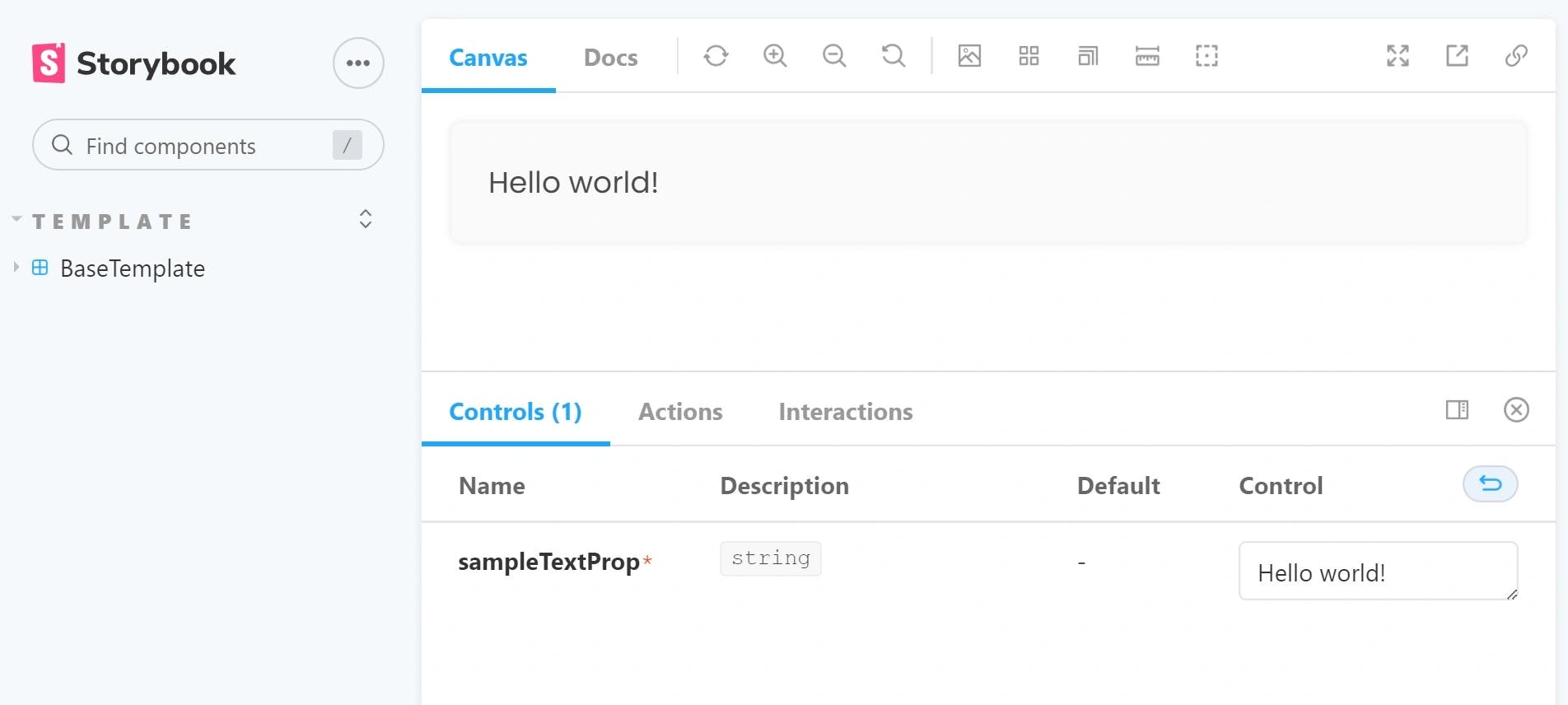
} as IBaseTemplateProps;Now, if we run npm run storybook you will notice that Storybook will automatically open the preview page.
And that's all. You have your first story ready!
Final Thoughts
Storybook is a powerful tool for documenting the UI visually. This way, you can have a snapshot of the current state of your components.
How we can see this not only benefits the development team but also provides an overview to the design team that can improve their decision making
Finally, we create a BaseTemplate story that will help us to "automatically" create our stories as we will see in a following post.